NavigationDrawer
Material Design Navigation Drawer component.
Navigation Drawer is a panel that slides in horizontally from the left or right edge of the view to show primary destinations in an app.
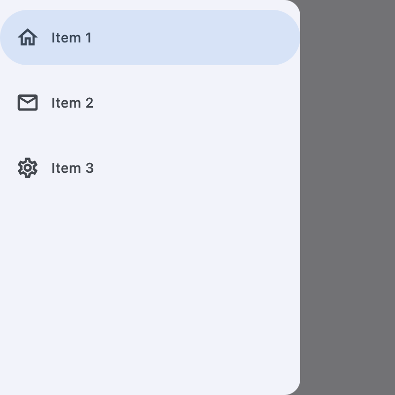
Example:
ft.NavigationDrawer(
    tile_padding=ft.Padding(top=10),
    controls=[
        ft.NavigationDrawerDestination(
            icon=ft.Icons.HOME_OUTLINED,
            label="Item 1",
        ),
        ft.NavigationDrawerDestination(
            icon=ft.Icons.MAIL_OUTLINED,
            label="Item 2",
        ),
        ft.NavigationDrawerDestination(
            icon=ft.Icons.SETTINGS_OUTLINED,
            label="Item 3",
        ),
    ],
)
Inherits: AdaptiveControl
Properties
bgcolor- The color of this navigation drawer.controls- Defines the appearance of the items within the navigation drawer.elevation- The elevation of this navigation drawer.indicator_color- The color of the selected destination indicator.indicator_shape- The shape of the selected destination indicator.selected_index- The index for the currently selected NavigationDrawerDestination.shadow_color- The color used for the drop shadow to indicate elevation.tile_padding- Defines the padding around destination tiles inside the drawer.
Events
on_change- Called when the selected destination changed.on_dismiss- Called when this drawer is dismissed.
Examples
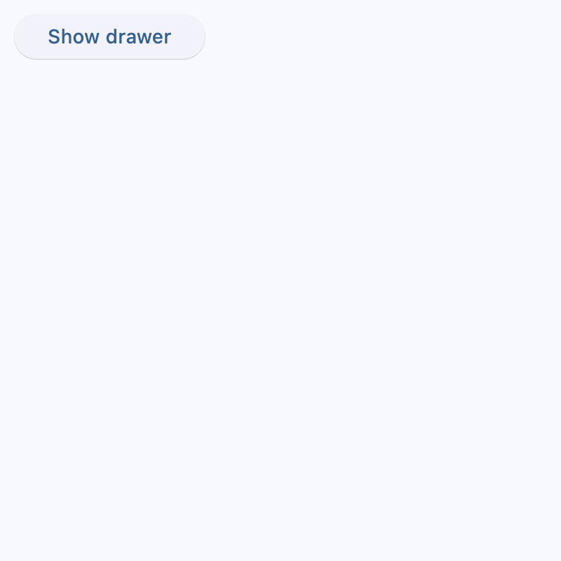
Start-aligned drawer
import flet as ft


def main(page: ft.Page):
    async def handle_show_drawer():
        await page.show_drawer()

    def handle_dismissal(e: ft.Event[ft.NavigationDrawer]):
        print("Drawer dismissed!")

    async def handle_change(e: ft.Event[ft.NavigationDrawer]):
        print(f"Selected Index changed: {e.control.selected_index}")
        await page.close_drawer()

    page.drawer = ft.NavigationDrawer(
        on_dismiss=handle_dismissal,
        on_change=handle_change,
        controls=[
            ft.Container(height=12),
            ft.NavigationDrawerDestination(
                label="Item 1",
                icon=ft.Icons.DOOR_BACK_DOOR_OUTLINED,
                selected_icon=ft.Icon(ft.Icons.DOOR_BACK_DOOR),
            ),
            ft.Divider(thickness=2),
            ft.NavigationDrawerDestination(
                icon=ft.Icon(ft.Icons.MAIL_OUTLINED),
                label="Item 2",
                selected_icon=ft.Icons.MAIL,
            ),
            ft.NavigationDrawerDestination(
                icon=ft.Icon(ft.Icons.PHONE_OUTLINED),
                label="Item 3",
                selected_icon=ft.Icons.PHONE,
            ),
        ],
    )

    page.add(
        ft.SafeArea(
            content=ft.Button(
                content="Show drawer",
                on_click=handle_show_drawer,
            )
        )
    )


if __name__ == "__main__":
    ft.run(main)
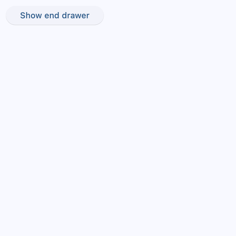
End-aligned drawer
import flet as ft


def main(page: ft.Page):
    async def handle_show_drawer():
        await page.show_end_drawer()

    def handle_dismissal(e: ft.Event[ft.NavigationDrawer]):
        print("Drawer dismissed!")

    async def handle_change(e: ft.Event[ft.NavigationDrawer]):
        print(f"Selected Index changed: {e.control.selected_index}")
        await page.close_end_drawer()

    page.end_drawer = ft.NavigationDrawer(
        on_dismiss=handle_dismissal,
        on_change=handle_change,
        controls=[
            ft.NavigationDrawerDestination(
                icon=ft.Icons.ADD_TO_HOME_SCREEN_SHARP,
                label="Item 1",
            ),
            ft.NavigationDrawerDestination(
                icon=ft.Icon(ft.Icons.ADD_COMMENT),
                label="Item 2",
            ),
        ],
    )

    page.add(
        ft.SafeArea(
            content=ft.Button(
                content="Show end drawer",
                on_click=handle_show_drawer,
            )
        )
    )


if __name__ == "__main__":
    ft.run(main)
Theming
import flet as ft
def main(page: ft.Page):
page.theme_mode = ft.ThemeMode.LIGHT
page.theme = ft.Theme(
color_scheme_seed=ft.Colors.INDIGO,
navigation_drawer_theme=ft.NavigationDrawerTheme(
bgcolor=ft.Colors.RED_300,
indicator_color=ft.Colors.INDIGO_100,
icon_theme={
ft.ControlState.DEFAULT: ft.IconTheme(
color=ft.Colors.INDIGO_900,
size=22,
),
ft.ControlState.SELECTED: ft.IconTheme(
color=ft.Colors.YELLOW,
size=28,
),
},
label_text_style={
ft.ControlState.DEFAULT: ft.TextStyle(
color=ft.Colors.YELLOW,
size=11,
italic=True,
),
ft.ControlState.SELECTED: ft.TextStyle(
color=ft.Colors.INDIGO_900,
size=15,
weight=ft.FontWeight.BOLD,
),
},
),
)
page.drawer = ft.NavigationDrawer(
controls=[
ft.Container(
padding=ft.Padding.only(left=28, top=20, bottom=12),
content=ft.Text(
"Workspace", theme_style=ft.TextThemeStyle.TITLE_MEDIUM
),
),
ft.NavigationDrawerDestination(
icon=ft.Icons.DASHBOARD_OUTLINED,
selected_icon=ft.Icons.DASHBOARD,
label="Dashboard",
),
ft.NavigationDrawerDestination(
icon=ft.Icons.NOTIFICATIONS_OUTLINED,
selected_icon=ft.Icons.NOTIFICATIONS,
label="Notifications",
),
ft.NavigationDrawerDestination(
icon=ft.Icons.SETTINGS_OUTLINED,
selected_icon=ft.Icons.SETTINGS,
label="Settings",
),
],
)
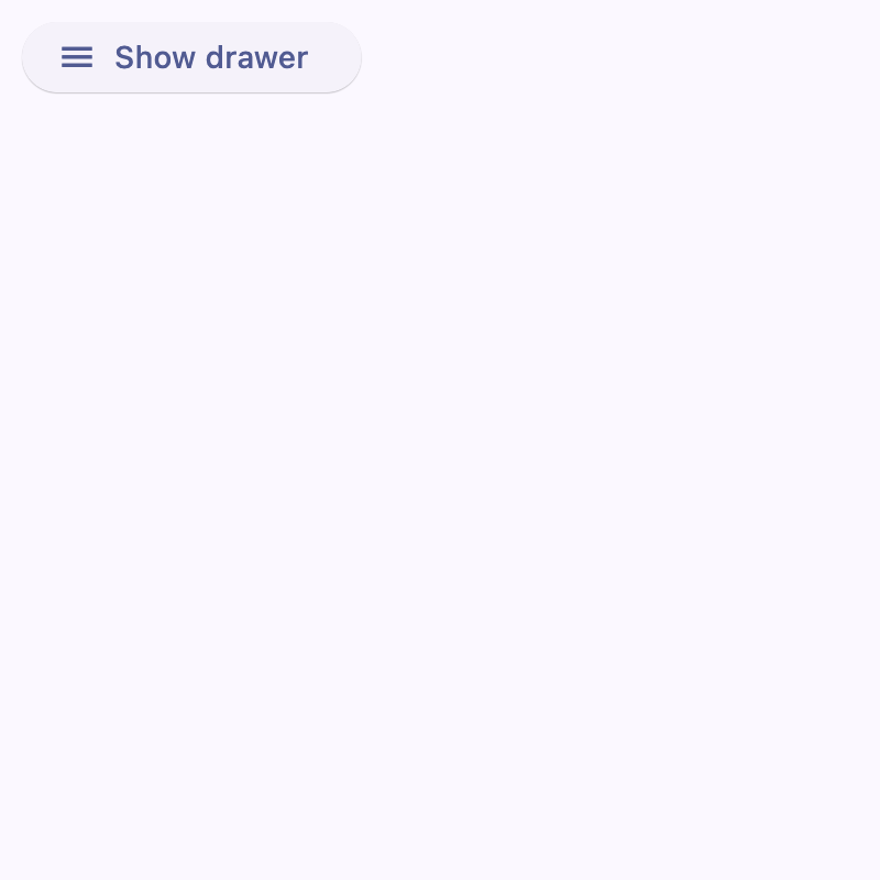
async def handle_show_drawer(e: ft.Event[ft.Button]):
await page.show_drawer()
page.add(
ft.SafeArea(
content=ft.Button(
"Show drawer",
icon=ft.Icons.MENU,
on_click=handle_show_drawer,
),
)
)
if __name__ == "__main__":
ft.run(main)
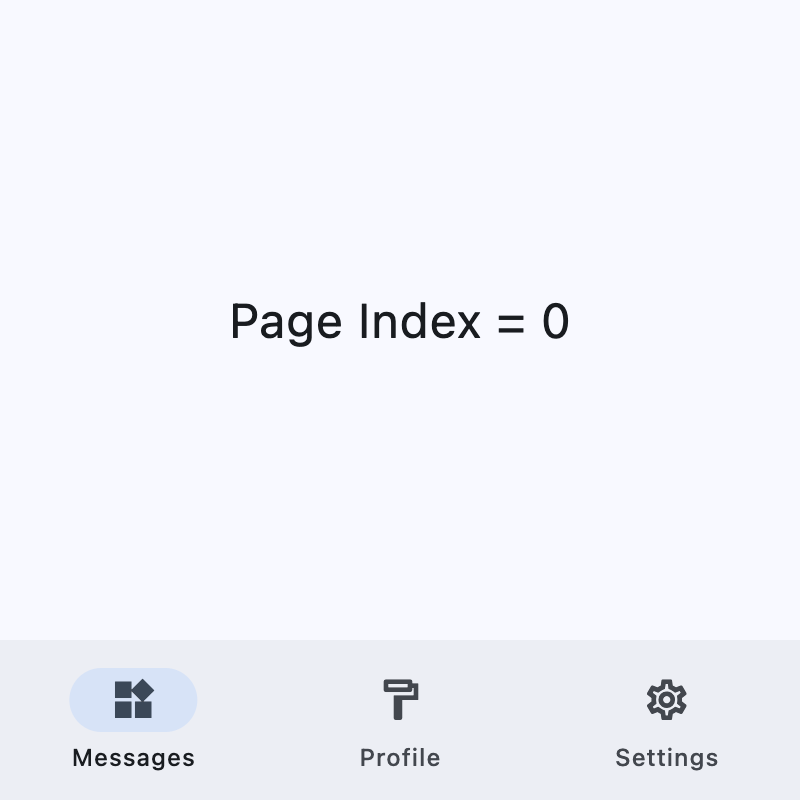
Adaptive navigation
This example switches between a NavigationBar
on narrow layouts and a NavigationRail with an
end NavigationDrawer on wider layouts.
import flet as ft

DESTINATIONS = [
    ("Messages", ft.Icons.WIDGETS_OUTLINED, ft.Icons.WIDGETS),
    ("Profile", ft.Icons.FORMAT_PAINT_OUTLINED, ft.Icons.FORMAT_PAINT),
    ("Settings", ft.Icons.SETTINGS_OUTLINED, ft.Icons.SETTINGS),
]


def main(page: ft.Page):
    page.theme_mode = ft.ThemeMode.LIGHT
    page.padding = 0

    screen_index = 0

    def build_page_index_text() -> ft.Text:
        return ft.Text(f"Page Index = {screen_index}", size=24)

    def set_screen(index: int):
        nonlocal screen_index
        screen_index = index
        render()

    def build_navigation_bar() -> ft.NavigationBar:
        def handle_nav_bar_change(e: ft.Event[ft.NavigationBar]):
            set_screen(e.control.selected_index)

        return ft.NavigationBar(
            selected_index=screen_index,
            on_change=handle_nav_bar_change,
            destinations=[
                ft.NavigationBarDestination(
                    label=label,
                    icon=icon,
                    selected_icon=selected_icon,
                )
                for label, icon, selected_icon in DESTINATIONS
            ],
        )

    def build_navigation_rail() -> ft.NavigationRail:
        def handle_nav_rail_change(e: ft.Event[ft.NavigationRail]):
            if e.control.selected_index is not None:
                set_screen(e.control.selected_index)

        return ft.NavigationRail(
            min_width=50,
            selected_index=screen_index,
            use_indicator=True,
            on_change=handle_nav_rail_change,
            destinations=[
                ft.NavigationRailDestination(
                    label=label,
                    icon=icon,
                    selected_icon=selected_icon,
                )
                for label, icon, selected_icon in DESTINATIONS
            ],
        )

    def build_end_drawer() -> ft.NavigationDrawer:
        async def handle_drawer_change(e: ft.Event[ft.NavigationDrawer]):
            set_screen(e.control.selected_index)
            await page.close_end_drawer()

        return ft.NavigationDrawer(
            selected_index=screen_index,
            on_change=handle_drawer_change,
            controls=[
                ft.Container(
                    padding=ft.Padding.only(left=28, top=16, right=16, bottom=10),
                    content=ft.Text(
                        "Header", theme_style=ft.TextThemeStyle.TITLE_SMALL
                    ),
                ),
                *[
                    ft.NavigationDrawerDestination(
                        label=label,
                        icon=icon,
                        selected_icon=selected_icon,
                    )
                    for label, icon, selected_icon in DESTINATIONS
                ],
            ],
        )

    def build_bottom_bar_layout() -> ft.SafeArea:
        return ft.SafeArea(
            expand=True,
            content=ft.Container(
                expand=True,
                alignment=ft.Alignment.CENTER,
                content=build_page_index_text(),
            ),
        )

    def build_drawer_layout() -> ft.SafeArea:
        async def open_drawer(e: ft.Event[ft.Button]):
            await page.show_end_drawer()

        return ft.SafeArea(
            expand=True,
            avoid_intrusions_top=False,
            avoid_intrusions_bottom=False,
            content=ft.Row(
                expand=True,
                controls=[
                    ft.Container(
                        padding=ft.Padding.symmetric(horizontal=5),
                        content=build_navigation_rail(),
                    ),
                    ft.VerticalDivider(thickness=1, width=1),
                    ft.Column(
                        expand=True,
                        alignment=ft.MainAxisAlignment.SPACE_EVENLY,
                        horizontal_alignment=ft.CrossAxisAlignment.CENTER,
                        controls=[
                            build_page_index_text(),
                            ft.Button("Open Drawer", on_click=open_drawer),
                        ],
                    ),
                ],
            ),
        )

    def render():
        page.clean()
        if (page.width or page.window.width) >= 450:  # wide layout
            page.navigation_bar = None
            page.end_drawer = build_end_drawer()
            page.add(build_drawer_layout())
        else:  # narrow layout
            page.end_drawer = None
            page.navigation_bar = build_navigation_bar()
            page.add(build_bottom_bar_layout())
        page.update()

    page.on_resize = lambda e: render()
    render()


if __name__ == "__main__":
    ft.run(main)
Properties
bgcolorclass-attributeinstance-attribute
bgcolor: Optional[ColorValue] = NoneThe color of this navigation drawer.
controlsclass-attributeinstance-attribute
controls: list[Control] = field(default_factory=list)Defines the appearance of the items within the navigation drawer.
The list contains NavigationDrawerDestination items and/or other controls such as headlines, padding containers, and dividers.
elevationclass-attributeinstance-attribute
elevation: Optional[Number] = NoneThe elevation of this navigation drawer.
indicator_colorclass-attributeinstance-attribute
indicator_color: Optional[ColorValue] = NoneThe color of the selected destination indicator.
indicator_shapeclass-attributeinstance-attribute
indicator_shape: Optional[OutlinedBorder] = NoneThe shape of the selected destination indicator.
selected_indexclass-attributeinstance-attribute
selected_index: int = 0The index for the currently selected NavigationDrawerDestination.
A valid selected_index is an integer between 0 and the number of
destinations minus 1. For an invalid value, for example -1, all
destinations will appear unselected.
shadow_colorclass-attributeinstance-attribute
shadow_color: Optional[ColorValue] = NoneThe color used for the drop shadow to indicate elevation.
tile_paddingclass-attributeinstance-attribute
tile_padding: PaddingValue = field(default_factory=(lambda: Padding.symmetric(horizontal=12)))Defines the padding around destination tiles inside the drawer.
Events
on_changeclass-attributeinstance-attribute
on_change: Optional[ControlEventHandler[NavigationDrawer]] = NoneCalled when the selected destination changed.
on_dismissclass-attributeinstance-attribute
on_dismiss: Optional[ControlEventHandler[NavigationDrawer]] = NoneCalled when this drawer is dismissed.